Monday, 24 January 2011
Final Magazine Front Cover Analysis
I have analysed the front cover me and my group created using Photoshop.

Sunday, 23 January 2011

Saturday, 22 January 2011
Inspiration From Magazine Covers
These covers were our inspiration.

In the draft, we used the 'plus' sign as we thought it stood out, and the boxes around the teasers as this also stood out. It also gives the cover a 'busy' feel, some think this is a good thing and others disagree. We used the red 'Total Film' masthead as red is a bold colour which is usually eye-catching, and incorporated the 'explosive 2011 preview' headline.
In the final, we decided to remove the 'plus' sign and boxes around the teasers because it made the cover look quite girly. The main image draft emphasised on this. So, when changing the main image, we changed other things. We kept most of the text red and white, and tried to use as less black as possible. The final cover looks much better, realistic and sophisticated.
Friday, 21 January 2011

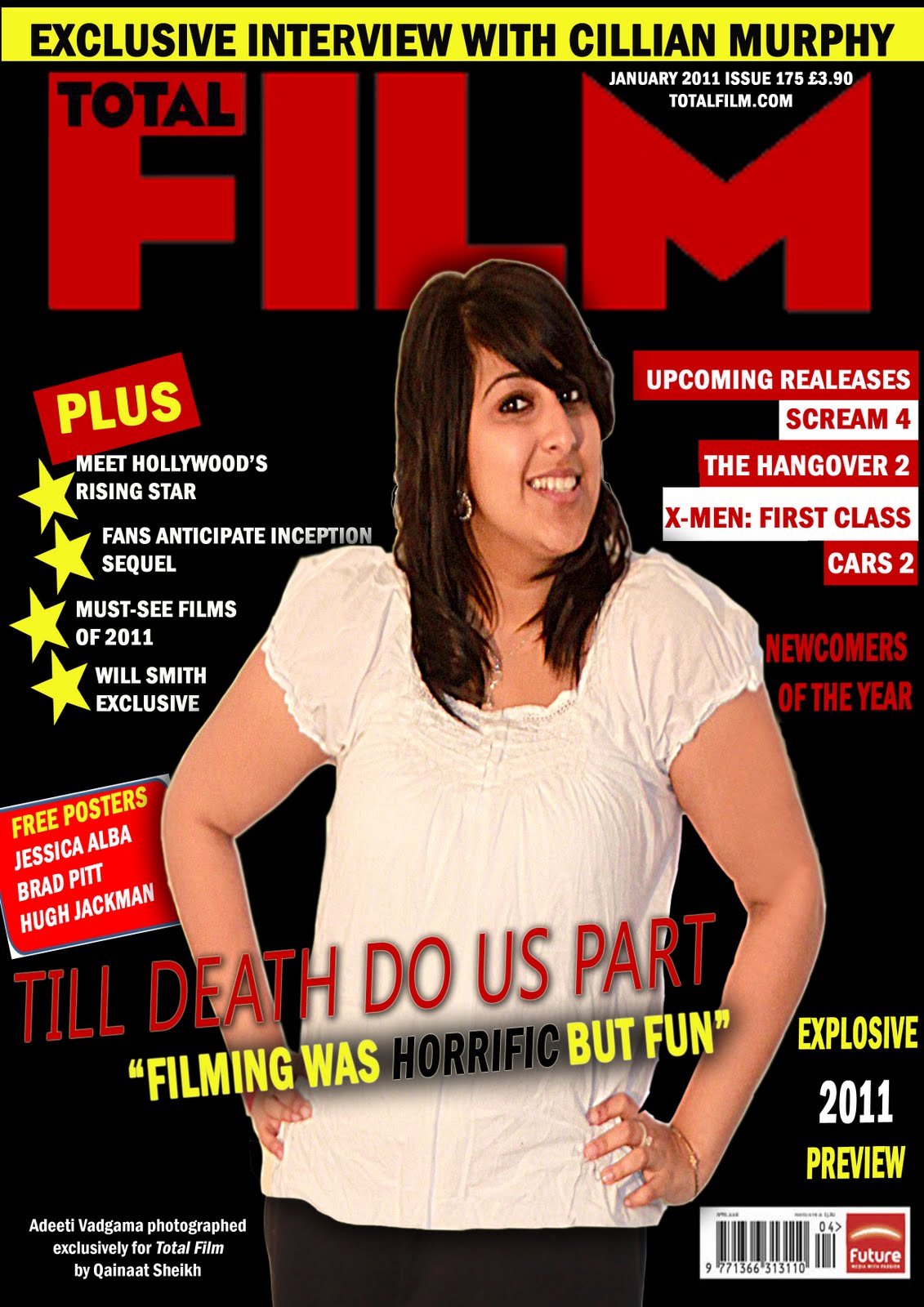
Final Magazine Cover
The magazine cover didn't look as if it was advertising a horror film, so we changed the main image. Adeeti looked too happy and the conventions were all over the place. As well as changing the main image, we decided to make the masthead stand out with blending options on Photoshop to symbolise Total Film's high status and to show that 'Til Death Do Us Part' is a new and upcoming film. The colour scheme was too bright in the previous cover so this time we decided to stick to red and white. We added a black border to make the overall cover stand out. We used a different font for 'Upcoming Releases' as we had noticed this is a common convention.


Thursday, 20 January 2011
Draft Of Magazine Cover
We then decided to use a 'regular' picture of Adeeti in which she is smiling and appears to look quite happy. This shows that in the image she is not in her character and is being her regular self, which would appeal to our target audience and fans of the film, or horror.

As you can see, Adeeti is standing against a white background. We didn't like the idea of this, so we decided to cut out Adeeti using the magnetic lasso tool and putting her onto a black background, with a red 'Total Film' masthead. We added teasers and headlines on both sides as this is a key convention of magazine covers. They looked quite dull so we added 'stars' as bullet points on the left, and on the opposite side they are on top of rectangles the opposite colour of the text. The stars represents the 'Hollywood stars'. We have a free posters sign which has a white outline, which looks like a sticker as it has been stuck onto the cover. We also added other covnentiond such as the main headline, barcode, issue number and much more. Our cover looked quite 2D so we decided to add a thin white outline around Adeeti and a shadow to make her stand out of the page.


As you can see, Adeeti is standing against a white background. We didn't like the idea of this, so we decided to cut out Adeeti using the magnetic lasso tool and putting her onto a black background, with a red 'Total Film' masthead. We added teasers and headlines on both sides as this is a key convention of magazine covers. They looked quite dull so we added 'stars' as bullet points on the left, and on the opposite side they are on top of rectangles the opposite colour of the text. The stars represents the 'Hollywood stars'. We have a free posters sign which has a white outline, which looks like a sticker as it has been stuck onto the cover. We also added other covnentiond such as the main headline, barcode, issue number and much more. Our cover looked quite 2D so we decided to add a thin white outline around Adeeti and a shadow to make her stand out of the page.
Tuesday, 18 January 2011
Ideas For Magazine Cover
Creating the magazine cover was the most difficult task. In fact, it was harder than editing the actual trailer! Despite being more familiar with Photoshop than Sony Vegas, it was difficult to come up with the right concept for the cover. As the trailer is of the horror genre, I was unsure whether to take an image related to that or regular shots. Me and my group took over 100 photos of our 2 lead actors - some on their own and some together.
It was difficult choosing the right image, but in the end I did. However, I had to start over around 4 or 5 times with different images.


It was difficult choosing the right image, but in the end I did. However, I had to start over around 4 or 5 times with different images.


Sunday, 16 January 2011
The Dark Knight Magazine Front Cover Analysis
This is an analysis of an existing film cover, to help me create my own for Till Death Do Us Part with my group.


Thursday, 13 January 2011
Feedback From Social Networking Sites
After completing our trailer, we thought it would be a good idea to post it on different social networking sites. On behalf of the groups, I thought it would be a good idea to post it through my personal Twitter account. The trailer received a lot of feedbsck which was mainly positive. A friend of mine was kind enough to post it onto her Facebook account as the group didn't want anyone within our college to see it just yet! Each group member has uploaded it to their own personal YouTube account. 


Wednesday, 12 January 2011
Choice Of Music
Till Death Do Us Part isn't a slasher film, and in the trailer the scenes build up a lot of tension. It starts off with an establishing shot and gradually gets faster to make the audience feel quite panicky. In order to find the perfect music, we searched different types of music on YouTube.
We found two pieces of music which were perfect for our trailer. The first piece is quite slow but builds up a lot of tension. It was too slow so we made it faster. The second piece is quite jumpy and emphasises on the speed of the quick shots. We merged both of them together.
We included a 'heart beat' sound effect. After the victim is screaming in the trailer, the screen goes black and there is no sound, and the title of the film appears. This is when the 'heart beat' sound effect appears.
Jigsaw Productions
This is our final logo. It took quite a while to decide how to design as we had many ideas, but this was our best idea. The 'i' in Jigsaw on the puzzle piece shows that there's more to something that meets the eye.


Tuesday, 11 January 2011
The Process Of Editing
Insteading of using Adobe Premier which is available within the college, my group and I decided to use Sony Vegas. Sahar is quite experienced with this software so this was a benefit to us as none of us seemed to keen on using Premier. We all edited in any available frees we had at the same time and during Media lessons to make the most of the time we had. Although one group member was the most familiar with the software, we all edited together and made a group effort.
Editing was quite a lengthy process, however we were able to display our creative ideas through it in order to make the best possible trailer we can. To be quite frank, it was a learning process as I didn't know anything at all about the software or about editing. I thought it would be quite tedious but it wasn't.
The crop tool was used to zoom into a shot and focus on a specific object, such as Adeeti's necklace. This was effective as it emphasised on its significance in the film.

We used a night effect for various shots to make the edges dark and the overall shot, which complimented the featured eerie music. It also emphasised on the importance of that scene.

We adjusted the colour balance to lighten and darken scenes. This scene was filmed on a sunny morning, so darkening it was vital.

We used the blur effect to blur a specific part of the shot (by masking it)but leaving the rest as it is.

We did this by blending and overlaying both shots to become one, so it looks as if the necklace is swinging infront of Travoir, and then adjusted the opacity.

To make our trailer look as realistic as possible, we added a rating card at the beginning. We chose a red/restricted as it is not suitable for under 18s.


Friday, 7 January 2011
Production Name/Logo Ideas
This was quite difficult as we wanted a name which wasn't related to commercial horror and the logo to be creative yet simple.
We had an idea of the production name relating to being watched as this relates to our plot and is also quite relevant nowadays i.e. logos and symbols with an eye. To be different, we decided to use the letter 'i' instead of having an actual eye. However, this would seem an imitation of Apple products such as iPhone and iPod.
To play on our mysterious concept, in the end we came up with Jigsaw Productions. This is quite an unusual name. We decided on this name as it is symbollic of the fact that all puzzle pieces make up a whole jigsaw. This denotes how a narrative within a movie flows.
Wednesday, 5 January 2011
How Our Filming Went
Filming was quite successful, however my group did face difficulties.
Due to our actor's schedule incompatibility with ours, we had to film on specific days and at specific times, so we couldn't use all of our media lessons to film our trailer.
The first scenes were to be shot inside Streatham Station, however when we arrived there we found out we were unable to film inside because we hadn't been granted permission by railway management. This caused quite a disruption, however we overcame this by deciding to film outside the station. The staff still weren't happy however we continued to film because we weren't breaking any rules. Also, many of the shots had to be filmed more times than desired as pedestrians got in the way of our shots.
Our actor had to leave shortly after that so he wasn't available to film scenes in Streatham Ice Rink. So instead, I was used as a replacement as only his hand (with a black glove) and feet/legs were required to be seen. As I live 5 minutes away from the ice rink, I went home and wore similar black jeans to our actor and black trainers - so my lower body appeared to be quite masculine. Permission wasn't a problem at the ice rink.
Other scenes were filmed at Adeeti's house which took a couple of days. Due to the laidback environment, we didn't feel too pressurised which made us feel more comfortable with filming and filming at this location didn't take as long as the others.
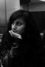
We were searching for an area within our college which looked quite unusual, and we found the perfect spot. It was a small area which was deserted, and we filmed bloody scenes there with a knife. We put fake blood on our actress' face, arms and hands. She appears to be slashed and bruised. As I was wearing all black that day and Travoir couldn't make it, I stepped in. Here are some pictures from filming in this location:


To emphasise on the fact that the victim is unable to escape, we decided to capture scenes of her running. This was also filmed in college. She is running and looks in pain as if she has been stabbed. Her appearance accentuates this:


Unfortunately I was unwell to film the rest of the scenes, however my group informed me of what had been filmed. Our actor plays a psychotic and obsessive stalker, so to emphasise on this we decided to have a scene with various pictures of Adeeti stuck on a white wall, and another showing him burning one of her pictures. At the train station, he picks up Adeeti's locket from the ground and keeps it; another scene shows him staring at it in a manic way which conveys to the audience that the locket is significant in the plot.
Overall, filming was challenging but enjoyable. It was difficult to stick to our schedule so filming took longer than planned. If I was to do this again with my group, filming time would be planned better to avoid difficulties with our actor.
Due to our actor's schedule incompatibility with ours, we had to film on specific days and at specific times, so we couldn't use all of our media lessons to film our trailer.
The first scenes were to be shot inside Streatham Station, however when we arrived there we found out we were unable to film inside because we hadn't been granted permission by railway management. This caused quite a disruption, however we overcame this by deciding to film outside the station. The staff still weren't happy however we continued to film because we weren't breaking any rules. Also, many of the shots had to be filmed more times than desired as pedestrians got in the way of our shots.
Our actor had to leave shortly after that so he wasn't available to film scenes in Streatham Ice Rink. So instead, I was used as a replacement as only his hand (with a black glove) and feet/legs were required to be seen. As I live 5 minutes away from the ice rink, I went home and wore similar black jeans to our actor and black trainers - so my lower body appeared to be quite masculine. Permission wasn't a problem at the ice rink.
Other scenes were filmed at Adeeti's house which took a couple of days. Due to the laidback environment, we didn't feel too pressurised which made us feel more comfortable with filming and filming at this location didn't take as long as the others.
We were searching for an area within our college which looked quite unusual, and we found the perfect spot. It was a small area which was deserted, and we filmed bloody scenes there with a knife. We put fake blood on our actress' face, arms and hands. She appears to be slashed and bruised. As I was wearing all black that day and Travoir couldn't make it, I stepped in. Here are some pictures from filming in this location:


To emphasise on the fact that the victim is unable to escape, we decided to capture scenes of her running. This was also filmed in college. She is running and looks in pain as if she has been stabbed. Her appearance accentuates this:


Unfortunately I was unwell to film the rest of the scenes, however my group informed me of what had been filmed. Our actor plays a psychotic and obsessive stalker, so to emphasise on this we decided to have a scene with various pictures of Adeeti stuck on a white wall, and another showing him burning one of her pictures. At the train station, he picks up Adeeti's locket from the ground and keeps it; another scene shows him staring at it in a manic way which conveys to the audience that the locket is significant in the plot.
Overall, filming was challenging but enjoyable. It was difficult to stick to our schedule so filming took longer than planned. If I was to do this again with my group, filming time would be planned better to avoid difficulties with our actor.
Subscribe to:
Posts (Atom)